Siminvest
Designing a decision-support tool for brokers to communicate investment risk clearly
Fintech
B2B2C
Confidentiality Notice: This case study is based on professional experience in a regulated enterprise environment. All examples, descriptions, and visuals have been deliberately generalized, simplified, or reconstructed to avoid disclosure of proprietary information, internal systems, or confidential business practices. The content reflects my design approach and decision‑making.
Role
Product Designer (UI/UX)
Team
Me
Project Manager (project initiation & requirements)
Developers (feasibility & implementation alignment)
Platform
Desktop
Duration
4 months
Brokers were losing client confidence not because of bad products, but because guaranteed investment outcomes were hard to explain clearly in a live advisory session.
I designed a decision-support tool that shifted consultations from one-way explanations to shared, scenario-based exploration.
Impact 1
Less preparation, more flexibility
Brokers adjusted scenarios live instead of pre-building them, reducing preparation time before client consultations, boosting flexibility and interaction.
Impact 3
Behaviour change
Printed PDF summaries replaced by a live interface during client consultations.
Impact 4
Shipped & adopted
Launched and integrated into daily broker workflow across the team.
Context
The problem
The value proposition of the product is a capital guarantee - a financial protection that ensures investors receive back all or part of their original investment, even if market performance declines. Capital guarantees are genuinely difficult to communicate in a regulated advisory context to retail investors.
Working from a brief and close collaboration with the PM, I mapped how broker consultations with the customers actually broke down, and identified a pattern.
Finding 2
Clients couldn't connect the dots
Without adeguate visual comparison, clients struggled to understand how the guarantee actually behaved under different conditions.
Finding 3
No consistency across brokers
Explanations relied on verbal delivery, meaning quality varied by broker, creating compliance risk and eroding trust.
The problem wasn't the product: it was the absence of a clear visual reference during the conversation. Brokers and clients had no common ground to explore outcomes together.
My role
How did I solved it?
I worked from a brief and collaboration with the PM to map how consultations broke down and where client understanding failed.
I led concept development and direction, owning the interaction model and the feasibility dialogue with developers.
Close collaboration with PM, Brokers and Developers was relevant
Before handoff, I ran informal sessions with two brokers to sense-check clarity and usability, both responded positively to the comparison framework and the visual language.
Design direction
From insight to direction
The three findings pointed directly to three design principles that became the foundation of the solution.
1 - Make outcome comparable
Design idea 💡
Show guaranteed and non-guaranteed outcomes side by side, within a single consistent framework, making the value of the guarantee immediately visible.
Impact
The tool made the guarantee easier to understand and discuss transparently. It became central to client conversations, improved clarity and trust,
2- Pairing Data Visualization with Structured Natural Language
Design idea 💡
Combine structured data visualization with plain-language summaries so clients can interpret what they're seeing in context, not just observe numbers passively on a screen.
Impact
Pairing visualization with plain language summaries reduced the risk of client misinterpretation and gave brokers a more defensible way to communicate outcomes.
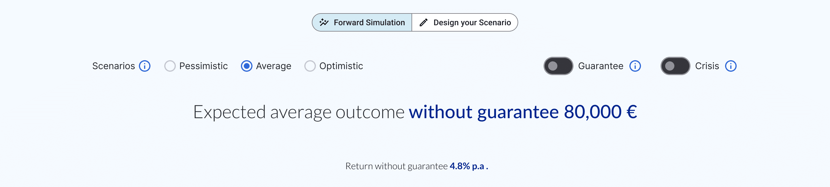
3 - Enable scenario exploration for “what if” discussions (Design your Scenario)
Design idea 💡
Let brokers adjust scenarios live, so clients see how the guarantee behaves under different market conditions, turning passive listening into active exploration.
Impact
This allowed building understanding through exploration rather than explanation. This supported deeper client engagement and more transparent communication of downside risk.
Outcome
What changed & how did the solution help the business and users?
Client conversations shifted from "what does this mean?" to "what happens if…?": from passive receiving to active exploration.
The tool changed not just how brokers presented information, but how clients related to it.
By giving both sides a shared visual reference, consultations shifted from one-way explanation to genuine exploration. Brokers could respond to what clients actually asked, in the moment, rather than following a script.
Outcome 1
From passive receiving to active exploration
Client conversations shifted from "what does this mean?" to "what happens if…?"
Outcome 2
Broker efficiency and flexibility improved
Broker could relay on a solid tool to conduct their live consultation, saving time for prior preparation.
Outcome 3
No consistency across brokers
Explanations relied on verbal delivery, meaning quality varied by broker, creating compliance risk and eroding trust.
Refelctions
What I learned
Designing SimInvest reinforced that financial tools are fundamentally about trust. In advisory contexts, clarity directly affects credibility and decision confidence, it is not just a usability goal.
This project strengthened my approach to designing systems which communicate complex technical concepts to non-specialist users. The goals is making them understandable, trustworthy, and aligned with real decision-making contexts, not just usable and visually appealing.
What worked well
Reframing under pressure
Pushing back on the "guaranteed figures first" framing was the most impactful decision I made. It's what gave the product integrity, and what brokers pointed to as most valuable.
Restraint as a design principle
In a regulated context, visual honesty matters more than visual persuasion. Holding that line was the right call for both trust and compliance.
Effective cross-functional collaboration
Close collaboration with PMs and brokers brought together product, commercial, and client perspectives. This helped balance business constraints, usability, and trust.
What I'd do differently
Involve end clients
The process was broker-led throughout, and that was the right call given the constraints. But brokers and clients have fundamentally different relationships with financial risk and visual information.
Challenge the intermediary assumption
The areas where we iterated most, information hierarchy and the guaranteed/non-guaranteed framing, were exactly where direct client input would have sharpened decisions faster.